Building a Resume with Splunk
A practical Dashboard that proves your skills

CyberSecurity 👽 | Splunk Ninja 🦸 | DataDog Tamer 🐾 | Sumo Logic Fighter 🧌 | Wazuh Explorer 🧙♂️ | EkoParty 2021 🎉 & SANS DFIR 2022 🔑 Speaker
This article walks through building an analytics-driven resume entirely in Splunk using Simple XML and SPL. Every visualization is generated from scratch using makeresults, making the dashboard portable and reproducible on any Splunk Enterprise or Splunk Cloud instance.
Why choose an analytics-driven resume over a traditional one?
Based on my experience interviewing candidates and reviewing endless applications, I strongly believe an analytics-driven resume gives you an undeniable edge.
Here's why:
A golden rule of resume writing is brevity (unless you are applying for an academic or government role requiring exhaustive detail). A well-designed chart condenses years of operational data into a scannable format.
Building a visual directly inside a tool you claim to know (like Splunk) and including the underlying SPL query in a footnote serves as instant proof of hands-on technical proficiency.
A single dashboard can map your career trajectory, display core competencies via targeted charts, and visualize your technical stack with a clean word cloud.
But this goes beyond formatting, it touches on a deeper issue in tech hiring: Badge inflation.
When a platform awards you a digital badge, does it mean someone actually validated your skills? Usually, no. Without proof, badges quickly lose value.
The real solution is an ePortfolio of mastery-level work.
Anyone can say they know Splunk. Anyone can post a badge claiming "Cisco/Splunk verifies SPL knowledge". But actually building a functional SIEM dashboard and search pipeline proves you understand SPL syntax, index management, and data ingestion.
As a hiring manager, which one would you trust more?... 🤨
Why build a resume in Splunk?
A resume is fundamentally structured data: employers, dates, skills, certifications, projects, talks, and publications.
Instead of a static PDF, I wanted to answer a different question:
Can my resume itself become a Splunk dashboard?
The answer is yes.
The result is a dashboard summarizing 15 years in cybersecurity, eleven years working with Splunk, detection engineering expertise, AI projects, certifications, and career progression.
The Most Underrated SPL Command: makeresults
Most SPL starts with indexed data:
index=wineventlog
| stats count by EventCode
makeresults starts with nothing.
| makeresults
It creates a synthetic event inside the search pipeline. That makes it incredibly useful for prototypes, tutorials, unit testing SPL, and dashboards that don't depend on production data.
Creating fields
| makeresults
| eval years=15
A single event now contains a numeric field called years, perfect for a Single Value visualization.
Building datasets
| makeresults
| eval skills="Splunk:20,Python:17,KQL:17"
| makemv delim="," skills
| mvexpand skills
| rex field=skills "(?<Skill>[^:]+):(?<Score>\d+)"
This transforms one string into multiple events.
Dashboard Overview
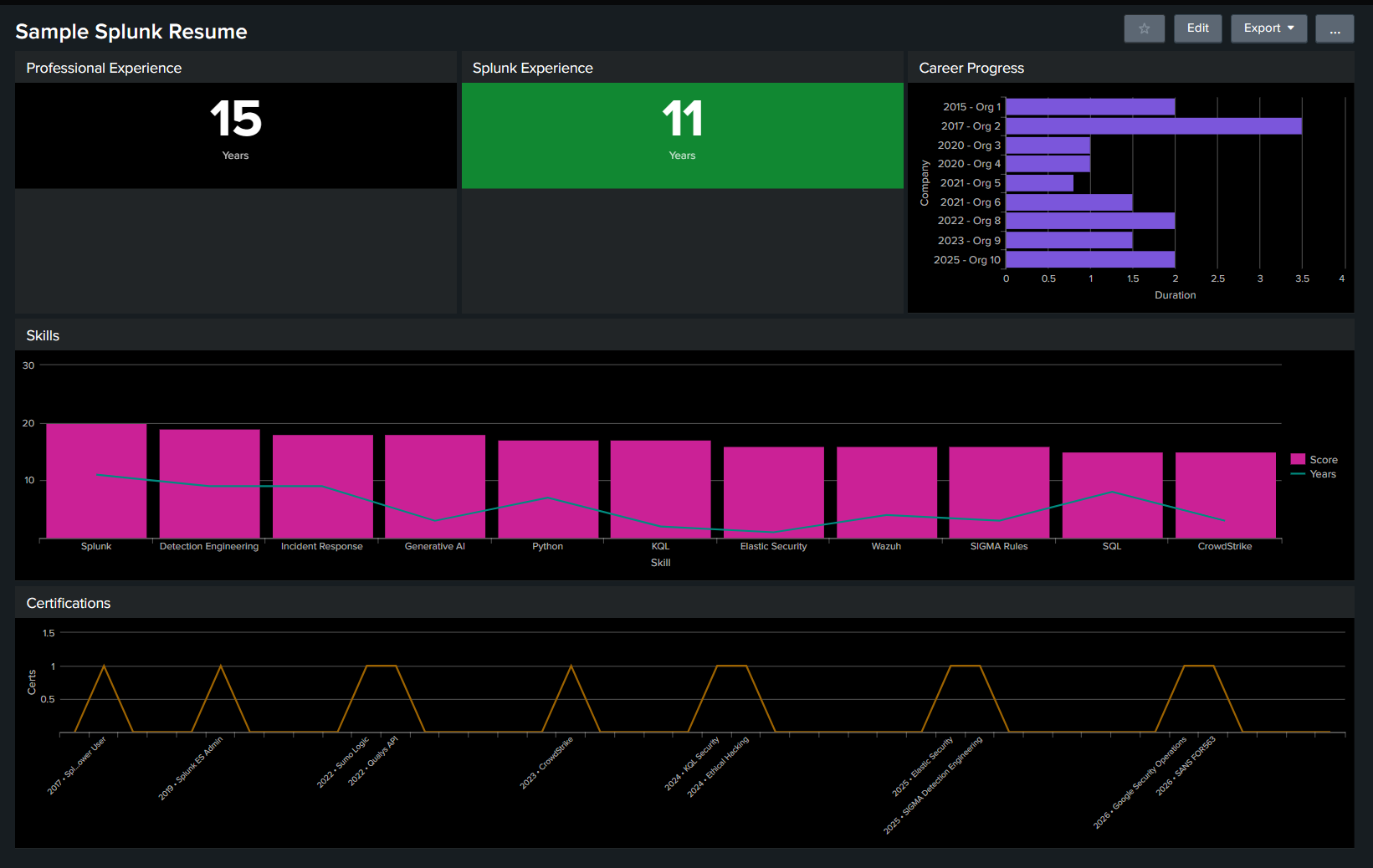
The dashboard contains five panels:
| Panel | Visualization |
|---|---|
| Professional Experience | Single Value |
| Splunk Experience | Single Value |
| Career Progress | Horizontal Bar |
| Skills | Column + Line Overlay |
| Certifications | Timeline |
Everything is generated using SPL.
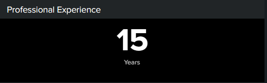
Panel 1 - Professional Experience
SPL
| makeresults
| eval years=15
This powers a Single Value visualization configured with block coloring and the label Years.
Panel 2 - Splunk Experience
SPL
| makeresults
| eval splunk_years=11
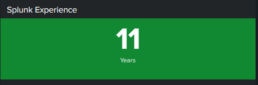
This KPI is intentionally green to match Splunk branding.
Panel 3 - Career Progress
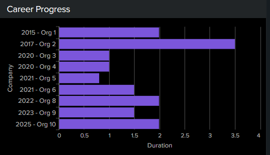
This panel converts career history into a horizontal duration chart.
SPL
| makeresults
| eval jobs="2015,2:Org1,2017,3:Org2,2020,0.5:Org3,2020,0.7:Org4,2021,0.7:Org5,2021,0.6:Org6,2022,1.4:Org7,2023,1.3:Org8,2025,1.6:Org9"
| makemv delim="," jobs
| mvexpand jobs
| eval jobs=trim(jobs)
| eval Year=if(match(jobs,"^\d{4}$"),tonumber(jobs),null())
| streamstats current=f last(Year) as JobYear
| rex field=jobs "^(?<Duration>\d+(?:\.\d+)?):(?<Company>.+)$"
| where isnotnull(Company)
| eval Duration=tonumber(Duration)
| eval Company=tostring(JobYear)." - ".Company
| table Company Duration
Why streamstats?
streamstats current=f last(Year) remembers the previous year event and attaches it to the following company record, allowing us to pair years with employers.
A horizontal bar chart communicates job duration much better than a line chart.
Panel 4 - Skills Dashboard
SPL
| makeresults
| eval skill_data="Splunk:20:11,Detection Engineering:19:9,Incident Response:18:9,Generative AI:18:3,Python:17:7,KQL:17:2,Elastic Security:16:1,Wazuh:16:4,SIGMA Rules:16:3,SQL:15:8,CrowdStrike:15:3"
| makemv delim="," skill_data
| mvexpand skill_data
| rex field=skill_data "(?<Skill>[^:]+):(?<Score>\d+):(?<Years>\d+)"
| eval Score=tonumber(Score)
| eval Years=tonumber(Years)
| table Skill Score Years

Visualization
Columns = proficiency score.
Overlay line = years of experience.
This lets readers compare skill confidence against real-world experience.
Panel 5 - Certifications Timeline
SPL
| makeresults
| eval certs="2017:Splunk Power User,2019:Splunk ES Admin,2022:Sumo Logic,2022:Qualys API,2023:CrowdStrike,2024:KQL Security,2024:Ethical Hacking,2025:Elastic Security,2025:SIGMA Detection Engineering,2026:Google Security Operations,2026:SANS FOR563"
| makemv delim="," certs
| mvexpand certs
| rex field=certs "(?<Year>\d+):(?<Certification>.*)"
| eval Label=Year." • ".Certification
| eval Value=1
| table Label Value
A scatter timeline is an even better visualization because certifications are discrete milestones.

Why I used makeresults instead of Lookups
makeresults makes this article completely reproducible.
Readers don't need indexes or CSV files. They can paste the SPL into Splunk and immediately recreate every visualization.
In production I'd replace synthetic datasets with:
| inputlookup skills.csv
This separates data from presentation while keeping the dashboard maintainable.
Your Craft demonstrates Mastery better than Badges
A certification proves you completed a curriculum. A working dashboard demonstrates:
SPL proficiency.
Regular expressions.
Multivalued field manipulation.
Search pipeline design.
Dashboard engineering.
Data visualization.
That is much harder to fake. 😉 Now you know! 🚀


